


SCW Blog
Tip of the Week: How to Use the Heat Maps Feature in Excel

Microsoft Excel is a really useful tool for organizing data. Using something called a heat map strategy can help you get more out of the solution. If you actively use spreadsheets in your business to contextualize data, you will find this easy-to-use tip for using heat maps really useful.
What is an Excel Heat Map?
The heat map is simply a way to represent the data in a spreadsheet that portrays a more in-depth context than the base data can provide.
For example, say you have a dataset and you wanted to give a summary of what the whole thing represents. One of the best ways to do this is with a heat map. Let’s look at an example:
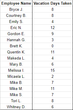
Say you want to be sure your team is using their sick time. Healthy and happy workers work better and studies have shown that workers that use their available time off are happier and healthier. If you have a 15-person team, it’s a fair amount of data to sift through to get answers. Here’s how heat mapping works.
Here is the dataset that we want to use:
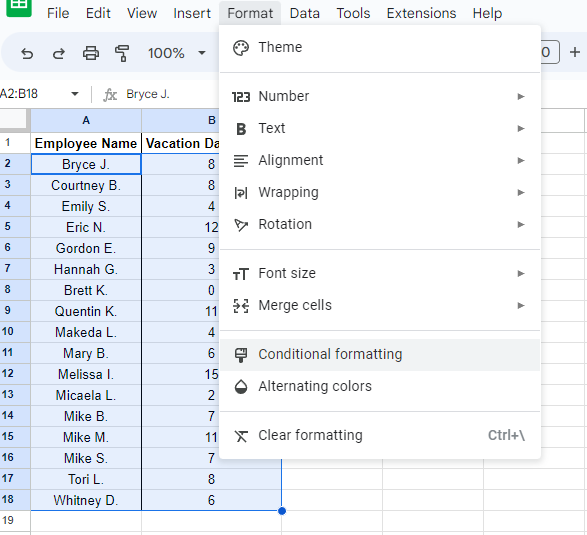
You just need to highlight the names and the numbers of days taken sick, select Format from the menu, and click on Conditional formatting.
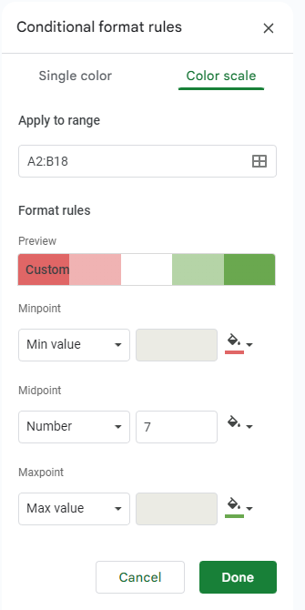
Once the Conditional format rules window opens, select + Add another rule and then select Color scale.
You’ll then see your selected range defined in the Apply to range box. You will see an additional field with Format rules available. Under Minpoint, make sure Min value is selected, and then you can select the color that you want to use to represent that value. For this example, we’re trying to determine which employees have used the least number of their available days, so we’ll go with red, as it’s a bit of a red flag. Under Maxpoint, do the same, but select Max value and select a different color. Since these employees are the ones who are using enough of their vacation days, we’ll use green.
For Midpoint, use the number between the highest and the lowest. For our example, we’ll estimate that this value is 7.
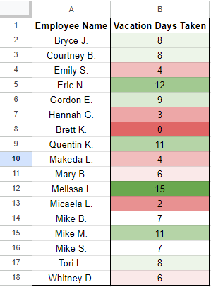
Click Done, and your spreadsheet will light up with different colors, with green representing the highest amount of days off and red representing the fewest. You will see below that as the number of days off escalates, colors change.
This is just one example of the use case for heat mapping. You can use it on any data set to quickly get a visual representation of the underlying data much faster than trying to sort it all.
For more great tips and tricks, give the IT professionals at SCW a call at (509) 534-1530 and return to our blog regularly.
About the author
Mobile? Grab this Article!
Tag Cloud
Comments